
The Painted Realm is excited to share an official first look at a new Sorcery: Contested Realm card for the upcoming Frostmage vs. Lavamancer set and its original artwork.
The Painted Realm started as a gallery of the original artwork of Sorcery: Contested Realm, showcasing collectors’ framed paintings via thepaintedrealm.com and expanded to artist stories, the craft behind the cards, and Discord for collectors and art enthusiasts. It's where the game's hand-painted art gets room to breathe, celebrating the artists who create it and the community that collects it. Thank you to Erik's Curiosa for allowing us to be part of the reveals.
The artist behind Deep Snow, Jussi Pylkäs, has been featured in every main Sorcery set released to date. We sat down to talk about the card, his process, and how six plus years of painting for this game has shaped his works.
Meet Deep Snow

Even Jussi wasn't entirely sure what he was walking into. "First it was supposed to be like a site where you had to walk a minion there and then you couldn’t attack until the next turn," he explained. What it became instead is a snowbound site that slows movement and punishes fast decks or perhaps gives your own room to attack. Jussi himself floated a couple ideas on the spot, such as an aggro Avatar of Air blowing blockers into the Deep Snow perhaps together with Tooth Fairies at an adjacent site.
It's a card for board control and tempo play, the kind of utility site that can shut down a rush deck early, buying a slower deck the time it needs to stabilize, or clear your path to victory. And because the effect is not limited to the surface, even threats like Root Spiders are caught in its frosty grip. It's a detail Jussi was quick to point out, and one that suggests the card may find a home in more decks than people expect, constructed and limited alike.
The Brief: Loose by Design

Pencil Scan Sketch
Unlike other games that provide artists with tightly scripted mechanical direction, Jussi says Erik’s Curiosa tends to keep things simple. 'It leaves me freedom of creativity,' he told me. For Deep Snow, the instruction was essentially the concept itself: deep snow, a valley, figures struggling through it, with the rest left largely to his imagination. That freedom led to a band of Viking-esque figures trudging through a snow choked valley.
Jussi noted that his relationship with Erik has evolved. Early on, he often didn't know what a card would actually do. Now, as both a long-time contributor and an active player, he sometimes gets a bit more context, which helps him decide how to interpret a brief.
A Favorite Detail
Jussi's favorite detail in the piece is the figure on the left side of the painting, buried armpit-deep: 'he's not having the best of days,' Jussi chuckled. It's a small, human touch in an otherwise dramatic winter scene, and exactly the kind of detail that rewards slowing down to enjoy the art rather than reading the text and moving on.

Why Snow Is Deceptively Hard to Paint
When I asked Jussi what the most challenging part of this piece was, his response was simple: the snow. 'Either you keep it like black and white and it's effective when it's just white, but then when you add color, you need to start thinking about the lighting,' Jussi said. He mentioned snow has a way of going visually flat unless you commit to layering in color, such as blues, greens, even yellows here, to keep the piece alive.

The result is a painting that reads as icy and cold at a glance, but rewards a closer look with warmth and depth running underneath. The light in Deep Snow pours down through the middle of the valley, washing the scene in blues and greens that keep the piece from ever feeling flat or empty.
One detail Jussi was especially thoughtful about: the characters' breath. It's a small thing, easy to miss at first glance, but it was a genuine design decision. Render it too wispy and translucent, and it risks blending into the background entirely. Render it too solid, and it starts covering up the scene behind it. Jussi settled on his signature semi-comic style, breath rendered almost as a tangible shape, grounded but never overwhelming the composition
An Evolving Style
Deep Snow also marks a point in a longer evolution of Jussi's work. Prior to producing art for Erik's Curiosa, he produced digital concept and texture art for videogames. He says he had to relearn painting by hand for Sorcery because he “was maybe 16 the last time I had actually painted non-digitally.”
Compare his Alpha pieces like Phase Assassin, Swamp Buffalo, or Fire Harpoons, to his more recent Gothic work, and the shift is obvious. The heavy black linework that defined his earlier pieces has gradually given way to color driven, painterly forms with less ink work holding everything together.

Alpha-era work

Recent Gothic-era work
Jussi explained the linework was never really the point. Early on, he would sketch and ink a piece before adding color, and found that the inked drawing alone felt incomplete without the lines reinforcing it. Over time, he started to feel the linework was becoming a crutch rather than a stylistic choice, and he has been consciously reducing it, even as he admits plenty of fans genuinely love the heavier inked look.
Part of that evolution comes from the artists around him. Jussi cites Dan Seagrave as a major influence from the Alpha days, admitting there's likely some subconscious influence still showing up in his work today. More recently, he's found himself drawn toward the brighter, bolder color choices of artists like Melissa Benson.
"It's still kind of hard for me to believe I'm working on the same project as artists like Melissa who created one of my favorite cards as a kid [Lord of Atlantis]. I used to play a lot of Merfolk decks, so I was a big fan boy and then it was kind of crazy realizing, wait, we're working on the...oh my God."
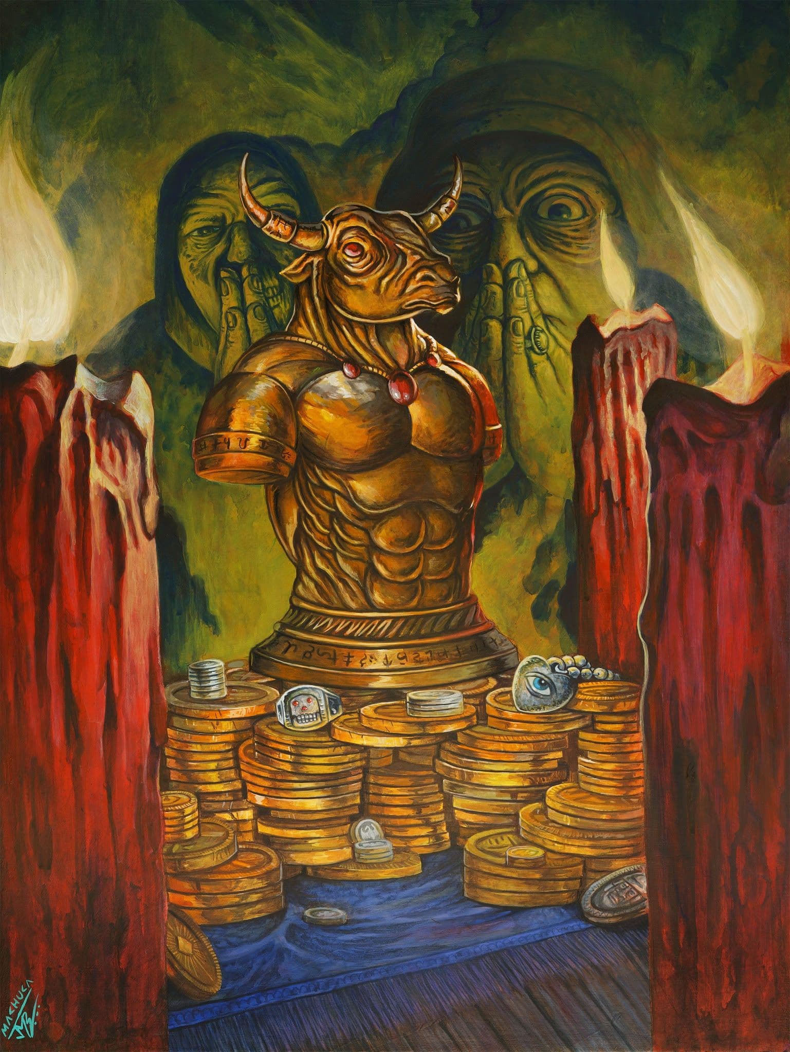
He also pointed to newer Sorcery artists like Juan Machuca and Zohn Dee as influences on his recent pieces, saying he can see his own style drifting toward a similar sensibility, while still keeping plenty of his own voice intact.
That evolving style isn't only about color and line, though. Scale has started to creep into Jussi's thinking too. He pointed to Juan's work as a particular inspiration here, noting how massive and detail-packed his pieces tend to be. A collector once told Jussi that pieces of that scale become conversation starters in a way smaller work simply can't, and that comment has stuck with him. Right now, he's still working at a relatively modest size, roughly A4 dimensions, largely because that's what fits in his scanner. But he's eager to work bigger, even knowing it means doubling his time investment for a piece twice the size.
Planning Around Foiling
After years working on the game, Jussi has also started designing with foiling in mind. These days, he keeps backgrounds more solid so the foil treatment has somewhere to really shine, letting a figure pop forward from a flatter, foiled background rather than burying the effect in detail. "Whoever does the foiling there is a hero," Jussi laughed, and it's hard to disagree. It remains one of the things that sets Sorcery apart from other trading card games, a level of care in presentation neither of us has seen matched elsewhere.
He also thinks more about including visual secrets for the full art backs of the foil cards, details hidden beneath where the text box normally sits, the kind of easter eggs fans enjoy looking for.
Playing What He Paints
Jussi isn't just an illustrator. He's an active Sorcery player, prepping for a Cornerstone tournament the very next day after we spoke. That dual perspective shapes how he approaches art. He thinks about mechanics as he sketches, such as how a piece will read once it's shrunk to card size and how the colors will pop. He mentioned Monks of Kobalsa as a personal favorite hidden gem, a card that rarely shows up outside limited play but that he believes has potential in constructed decks too.
That hands on relationship with the game goes back further than Sorcery itself. Jussi grew up playing Magic: The Gathering, starting around the Odyssey block, after discovering booster packs at a bookstore with his mother as a kid. His very first rare ripped from a pack was Necropotence, a card he remembers being baffled by at the time. He wanted dragons.

The Original Lives Beyond the Card
Jussi has spent years playing trading card games, but he says the Sorcery art community has given him a different perspective on the artwork itself.
"Listening to Sorcery art fans has kind of given me a whole new appreciation for the whole art thing."
For Jussi, the relationship between the painting and the people who appreciate it has become part of the experience of working on Sorcery. The community's enthusiasm has helped him look at his own work differently. The relationship doesn't end when the painting is scanned, printed and turned into a card. There is another life for the original.
A Sorcery card might be what first introduces you to the artwork, but the original tells a deeper story. Seeing the painting at full size, appreciating the choices and skill behind it, and hearing directly from the artist gives collectors another way to experience Sorcery.
That is what we hope to capture here at The Painted Realm: not just the incredible game we all love, but to provide wider access to the original art, the artists who create it, and a gathering place for the growing community of art enthusiasts who help give that work a life beyond the card.
Thanks to Jussi for his time, and we wish him the best of luck with his deck!
A huge thank you to Erik's Curiosa for giving us the opportunity to reveal a card for the upcoming set. This isn't something we thought would be possible for such a small, yet passionate, group of Sorcery players and art enthusiasts. If you are interested in seeing Sorcery art, feel free to check out the website where collectors post their framed-up originals, APs and sketches, and join the Discord.

Jussi Pylkäs in the Gallery

Zombie horde
Jussi Pylkas
Artist proof

Battlemage
Jussi Pylkas
Original · Gouache

Ghost ship
Jussi Pylkas
Original · Gouache

Fail-not Bow
Jussi Pylkas
Original · Gouache

Undertaker Engine
Jussi Pylkas
Artist proof

rebecs
Jussi Pylkas
Artist proof

blunderbore
Jussi Pylkas
Artist proof

swamp buffalo
Jussi Pylkas
Artist proof